This is the biggest set of changes we've shipped in a while. A new look across the whole site, our first color and font change in years. A rebuilt assignments page. And for the first time, Viserio works on your phone.
First, a look back at where this started.
Viserio, about two years ago.
A new look
Viserio has looked more or less the same for two years. Underneath it changed constantly, but the colors and the type stayed put. This release repaints the whole site.
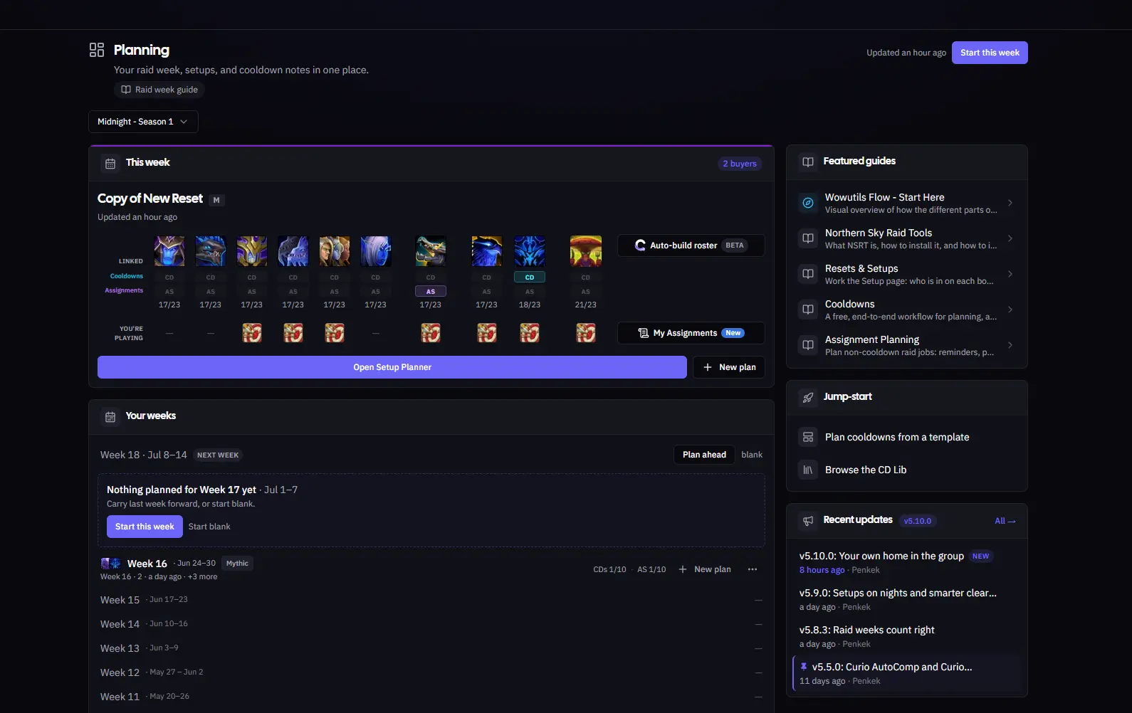
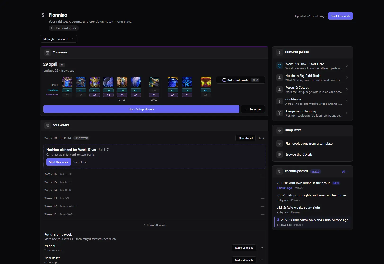
The Planning hub, before and after. Drag the handle to compare.
- A calmer, cooler palette. The whole site moved to a cooler, blue-tinted dark that sits easier through a long planning session, with a soft glow behind the main views instead of flat black.
- One clean typeface, everywhere. Text used to render in whatever font your device happened to pick. Now every page uses one consistent, sharper typeface, so numbers line up and long rosters stay easy to read.
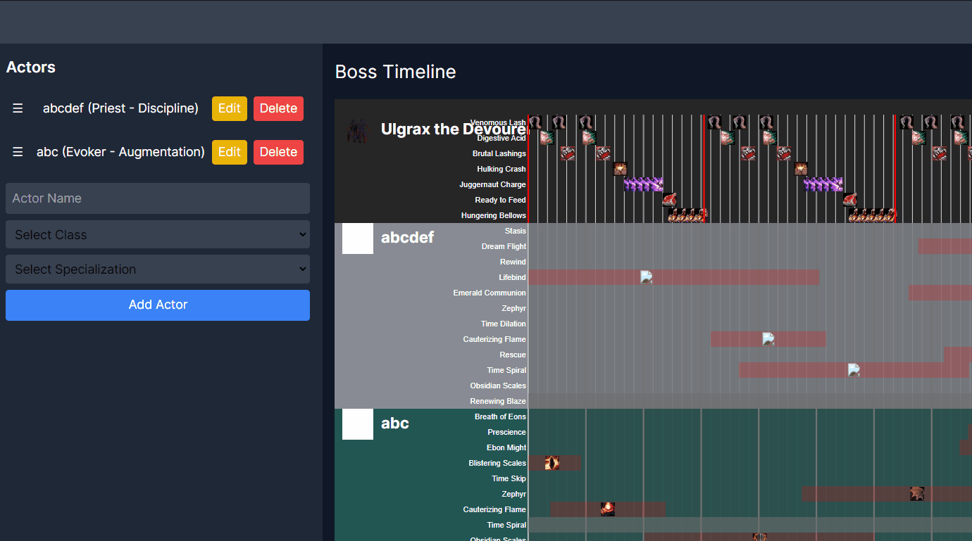
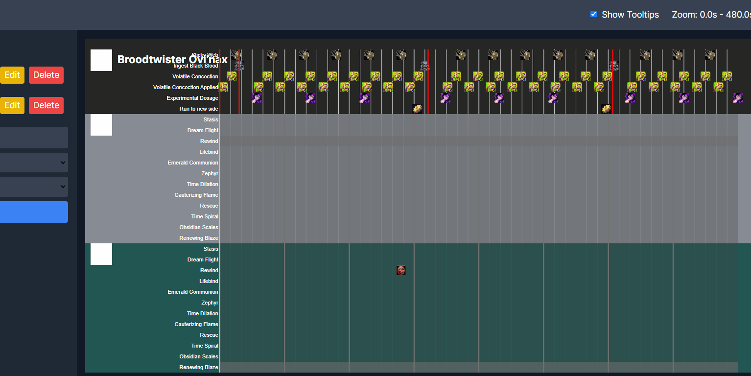
The cooldown timeline, the screen you spend the most time on, got the same treatment.
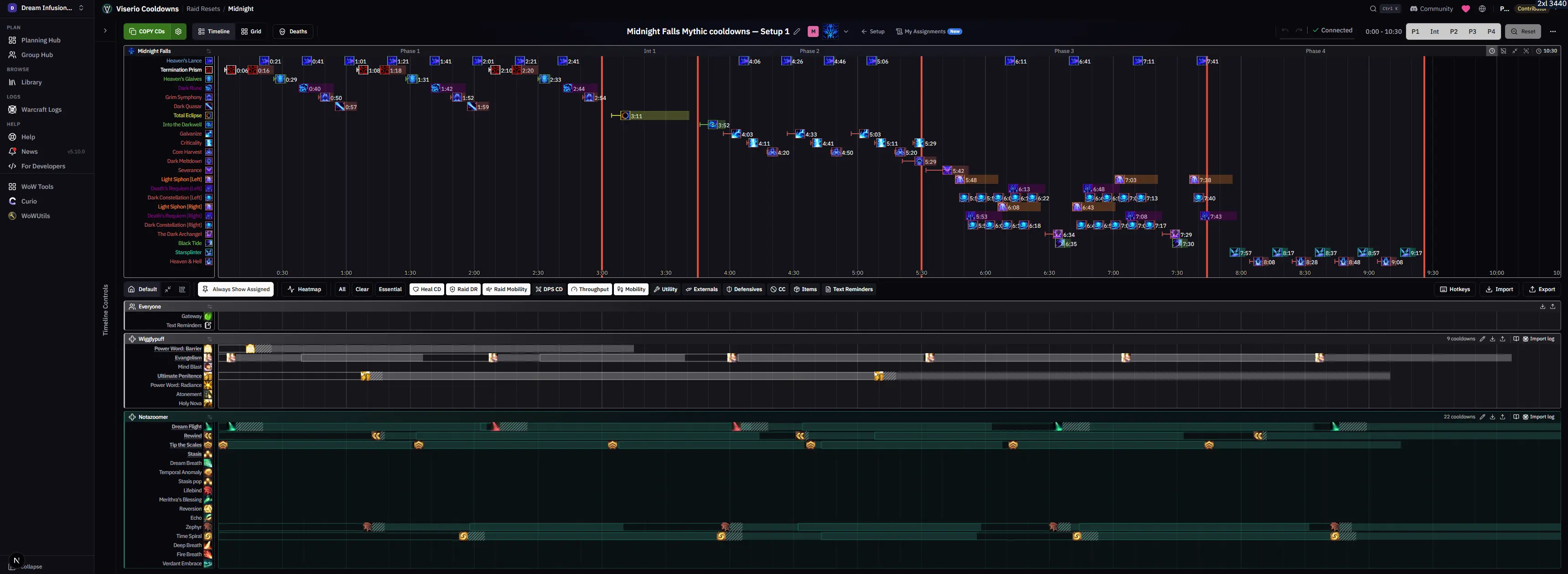
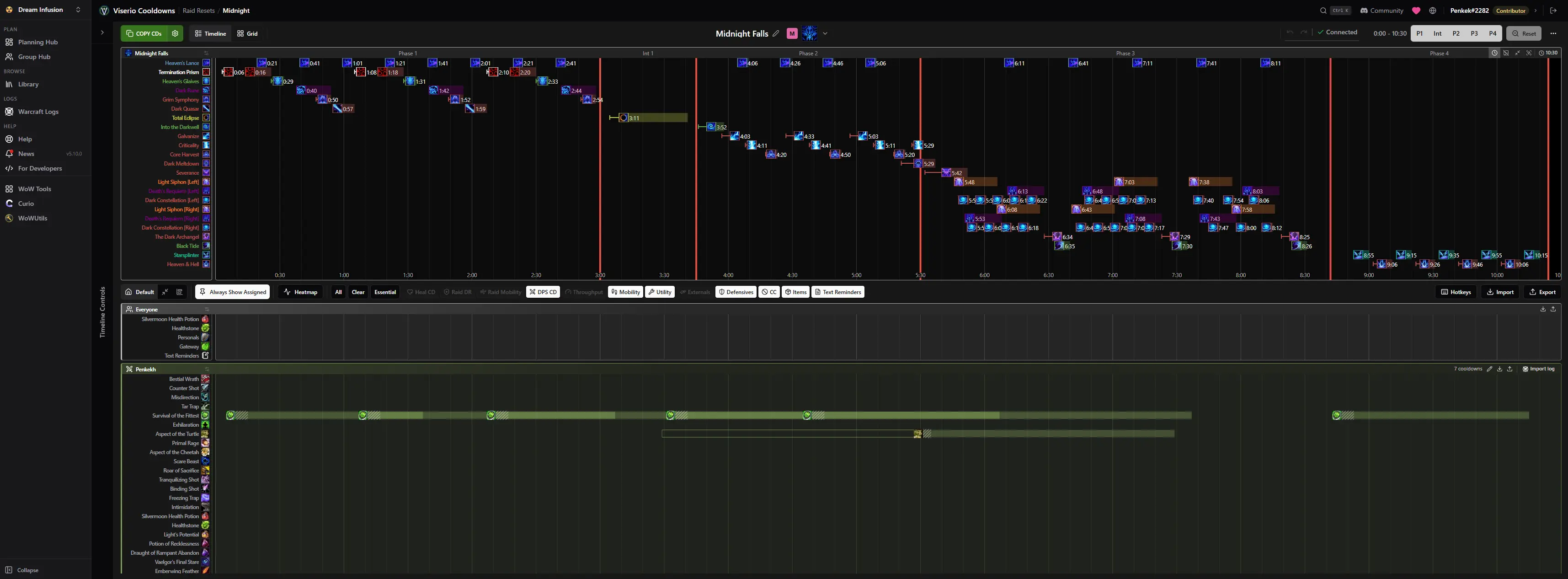
The cooldown timeline.
The small stuff got attention too. A reset card now tells you at a glance whether it's a template, linked to a setup, or still a draft.
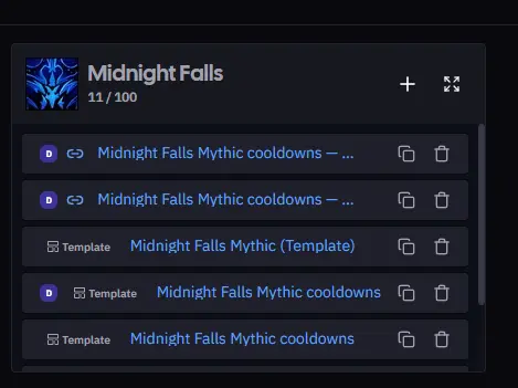
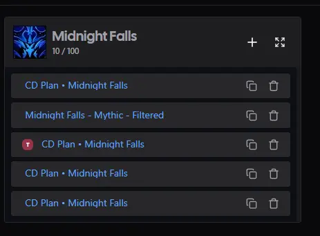
Reset cards, before and after.
Assignments, rebuilt
The assignments page is where you sort out everything that isn't a cooldown: who soaks, who kicks, who stands where on each spread. Every one of those sections had quietly grown to hold a lot, an addon reminder, a raidplan diagram, a full grid of seats, and the page showed every section fully open at once. On a real boss that meant scrolling through a wall of editors just to reach the one you wanted.

- Every section collapses to a summary card. Each block now sits as one row you can scan: its name, how many seats are filled, and a flag if someone assigned isn't in the raid or if you're the one on the hook. Click to open the one you want.
- Find your way around fast. Expand all or collapse all in a click, and the section list and shared links jump straight to a section and open it for you.
- Disabled sections get out of the way. Sections you've turned off for everyone drop into a "Hidden for everyone" area at the bottom, instead of sitting in the middle of the list greyed out.
- A cleaner header. Per-section actions moved into one tidy menu, and Copy All Assignments is right where you reach for it.
Open a section and you get the full thing: the raidplan diagram, the seats by role, and the pool of players to drag from.

Viserio on your phone
Until now, Viserio was a desktop tool. On a phone you couldn't even switch between groups, and half the pages ran off the edge of the screen. This is the thing raid leaders asked for more than anything else, so nearly every page got real work to make it read and behave on a phone. Many got a layout built just for it.
Tap any screen to see it full size.
- Switch groups and get anywhere. The full menu and your group list now open from a tap, so you're never stuck on one screen.
- Read who's on each boss, and swap a player. Open a setup on your phone, see the comp for each boss in this week's Midnight Season 1 plan, and make a change from a tap.
- Check your assignments on the way to raid. Assignment pages read as clean cards on a phone, with a "just mine" view so you see only the sections you're actually in.
- The pages you open on a phone all work now. Roster, loot, calendar, professions, guild bank: readable and usable, not squeezed to nothing.
- The timeline planner stays on desktop. Building a cooldown timeline needs the room, so that one screen is still a desktop job, on purpose.
Around the app
- Skip a boss without losing its work. A reset's boss headers now have a skip button that parks a boss you're not pulling this week and keeps its assignments for when you come back to it.
- See who can craft what. The Professions tab has a new "by profession" view and filters, so finding the raider who can make a specific item takes one look instead of scrolling every character.
- Attach a log to guild bank income. Income entries can now carry a link to the log or screenshot they came from, so the numbers have their receipts.
One more thing. The page you're reading got the new look too.
The news page, before and after.
As always, feedback and ideas are welcome in Discord or on the Community page.